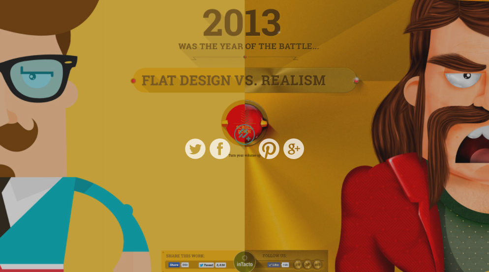
Every year, new trends emerge in web design. For the past year or so, one of the hot trends is a website design style called “flat design”. No shades and shadows, no gradients or textured backgrounds; clean and simple is what defines flat design.
So many of our Seattle website design clients come to us saying, “I want a clean, modern site with lots of white space”. This, my friend, is flat design. This design style is beautiful and simple. The generous open space in the design not only gives a better user experience, but the “less is more” theory also allows more emphasis on the design elements that are present.
What finally pushed flat design mainstream was the arrival of Apple on the bandwagon with IOS7. Apple's omnipotent presence and aesthetic shapes what people see and what The People want. Simple, modern, wide-open white space. It's a style that we, at Bizango, personally love and we’re happy to embrace this trend.
But, what about those fans of “realism” design? Design that features big, cinematic, gloriously-rich images capture our attention easily. Does flat design lack romance? Which style do you prefer? Take the design challenge; flat design vs. realism.


 3301 Burke Ave. N, #360 | Seattle, WA 98103