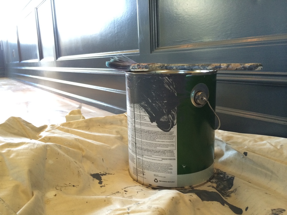
This week, our office has been in a state of disarray. After being in our space for almost a year, we are finally getting around to painting and making some improvements to it that we had been planning since signing the lease. What can I say, we’ve been busy.
So, now we are in the awkward phase of beautification. Conducting business as usual amid tarps and tape, desks pushed to the middle of the room, working around painters on ladders - I know this will all be over soon and we can put things back in order. And when we do it will be way nicer.
It's surprising, being in the web design business, that we had some difficulty when it came to choosing the right colors for the office. You’d think we would have no problem when it came to color and design of our space since design (for the web) is what we live and breathe around here. But, choosing a color palette for a website is different from choosing color for a physical space. For our office, our choice of color was guided by our surroundings. The view out our window, and the way the light plays off the buildings of downtown and Lake Union below set the stage for our palate.
This project has been a good reminder that even as designers, we all have areas of specialization and expertise. Sometimes it takes someone else with experience and a good eye to come in and make a suggestion. So, when we called upon our friend and client, Bev Bradshaw of Beverly Bradshaw Interiors, to help us with color, Bev came to our rescue.
After flipping through endless paint chips with Bev, as colors started to blur together and all the shades of blue-gray started to look alike, Bev magically put together a color palate that we would have never come up with ourselves. Bev’s confident, “Trust me.” was all the reassurance we needed (well, that and knowing that Bev is a great interior designer).
So, now that the painting almost complete, I can see it coming together. And its beautiful. I can’t wait to show you all photos which will come soon, I promise.


 3301 Burke Ave. N, #360 | Seattle, WA 98103